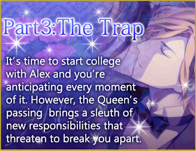
If the newest updates to a few of Voltage Inc. JAPAN’S games are any indication, it looks like we’re in for a switch to the new UI in the future for games already released with the original UI! I already posted these on Tumblr, but since I can’t sleep, I thought I’d make a post on it here.
More info below the cut!
So what else can we look forward to other than the UI change? Season 3!
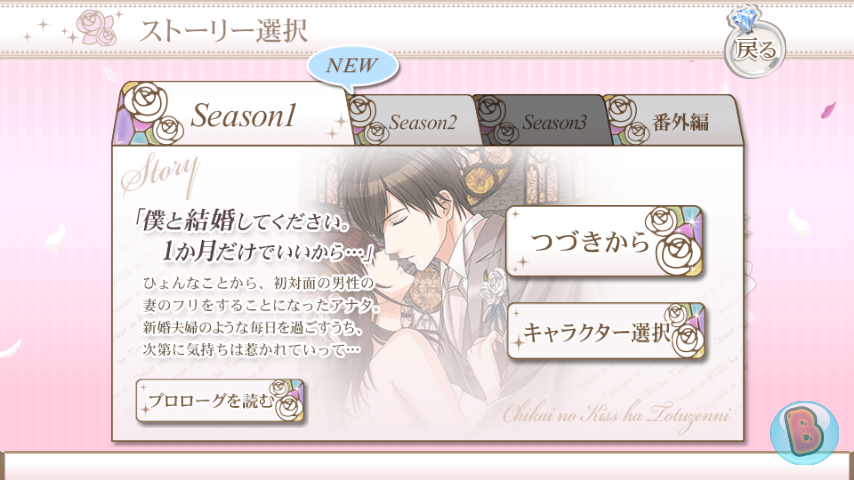
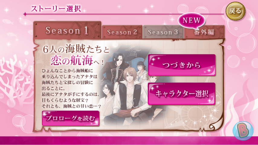
While the Season 3 tab has been added, there has yet to be any releases for either of these two games. But it definitely gives us something to look forward to! After finishing Russell’s sequel, I’ve been trying to hold myself back from buying the Japanese Season 2. Now, they’ve just made it even harder!
Along with this, we even get to read the Prologue to each additional season without having to buy a route first like the current UI makes us do.
Not only is there an additional tab, but all the stories for each season have been put together in one Character Info page.
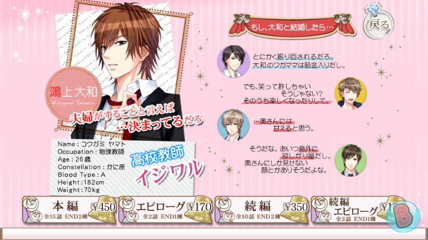
It definitely becomes very convenient, especially if you’re like me and sometimes taps the wrong story button on accident (like wanting to play an Epilogue, but tapping Main Story instead).
But best of all, these new UI updates means these games are now integrated to work on tablets! And judging by the Facebook page, this has been something fans have been wanting for a LONG time. I’m fine with the old UI, since the images are badly shrunken to fit my phone screen with the new UI, which really lowers the quality of the graphics. But this definitely makes me think of investing in a tablet in the future!
There has been no announcement on when we’ll get these updates. But one thing’s for sure: as long as we keep getting story updates, I’ll wait as long as I have to for the next updates! (Though I also don’t mind holding off on the new UI! I like my images as they are!)

